


Federal Civilian Employment Over the Decades: Explained
Making sense of a squiggly line spanning almost 90 years.
By Jim Reynolds | www.reynolds.com
August 31, 2026
There is a lot of American history hiding in one simple line.
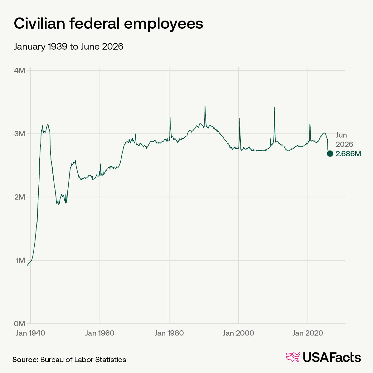
The graph above shows federal civilian employment from the late 1930s through 2026.
Note: This is federal civilian employment. Military personnel are not included.
At first glance it looks chaotic: a giant mountain in the 1940s, smaller humps, long flat stretches, strange vertical spikes every ten years, a pronounced decline in the 1990s, a rise under Biden, then a sharp drop under Trump.
But very little of it is random.
Once we lay history over the graph, most of the shape begins to make sense.
Here at Reynolds.com, we notice, evaluate, and explain patterns. You may find this interesting. Many of you lived through all of this.
The Giant Mountain
The easiest part to explain is the enormous rise during the early 1940s.
World War II.
In 1940, the executive branch employed about 699,000 civilians, excluding the Postal Service. By 1945, that number had climbed to roughly 3.37 million.
Most of the increase was connected to the military establishment. Civilian employment associated with the War and Navy departments rose from about 256,000 in 1940 to more than 2.6 million in 1945.
America was mobilizing almost its entire economy for war.
Millions of men were in uniform. Somebody still had to build, administer, transport, inspect, purchase, account for and manage the largest military operation in American history.
Washington hired people — a lot of them.
Then the war ended, and the line fell almost as dramatically as it had risen. By 1950, executive-branch civilian employment had dropped to about 1.44 million.
That is demobilization drawn as a line.
Korea Brings Some of It Back
Then the line rises again in the early 1950s.
The Korean War began in 1950, and federal civilian employment jumped from roughly 1.44 million to just over 2 million by 1952. That’s nearly a 40% gain and, again, Defense explains most of it.
Then Korea wound down, Eisenhower took office, and the number drifted lower again.
So the first fifteen years of the graph are remarkably straightforward:
Big war: employment rises.
War ends: employment falls.
Another war: employment rises.
War ends: employment falls.
History is doing most of the work. Makes sense, doesn’t it?
Then Something Changes
Beginning around 1960, federal employment starts growing more steadily.
This was no longer just wartime mobilization.
The Cold War was permanent. The space race was underway. Vietnam was coming. And the federal government’s domestic responsibilities were expanding. Democrats were in charge of the country.
Kennedy was followed by Lyndon Johnson and the Great Society. Medicare and Medicaid arrived. Regulatory activity increased. New programs required people to administer them.
By the end of the decade, federal civilian employment had risen substantially.
The important point is that America now had a much larger permanent federal establishment.
Washington did not return to its prewar size after WWII.
It never would.
What Are Those Crazy Spikes?
Now for the strangest-looking feature in the graph.
Look at 1960.
Then 1970, 1980, 1990, 2000, 2010, 2020.
Every ten years, federal employment shoots almost straight upward and then collapses.
Did America experience a government hiring panic every decade?
No.
Those are Census workers.
Every ten years the Census Bureau temporarily hires hundreds of thousands of people to count the population. BLS includes them in federal employment statistics.
When the Census is finished, they leave.
So when reading the graph, mentally erase those needles.
They are real employees, but they tell us almost nothing about the long-term size of the federal workforce.
They tell us that every ten years we count everybody — and then we send the counters home.
The 1970s: Bigger Government, Surprisingly Flat Employment
The 1970s are interesting because not much happens to the overall line.
Federal civilian employment stays around the same broad level through Nixon, Ford and Carter.
Yet nobody would describe that period as an era when the federal government stood still.
EPA.
OSHA.
Energy regulation.
Environmental regulation.
Entitlement growth.
Washington was expanding.
But direct federal headcount was not expanding proportionately.
That tells us something important:
Federal employment is not the same thing as the size of government.
Government can spend more money without directly employing more people. It can send money to states, issue grants, hire contractors, make transfer payments, regulate private companies and finance work performed outside the federal payroll.
That distinction becomes more important as the graph moves forward.
Reagan: A Military Buildup Without a Bureaucratic Explosion
The Reagan years initially look surprising. Reagan undertook one of the largest peacetime military buildups in American history, so you might expect federal civilian employment to soar along with it. It didn’t. Executive-branch civilian employment was about 2.14 million in 1981 and roughly 2.24 million in 1989—a relatively small increase considering the scale of the defense buildup.
What changed more than the overall headcount was the composition of the workforce. Defense civilian employment rose, while civilian-agency employment was more tightly restrained. That fits Reagan’s broader approach: build up the military while trying to limit the growth of domestic government. And much of the defense expansion came through weapons procurement, active-duty military personnel and private contractors rather than large additions to the federal civilian payroll.
So again:
A large increase in federal spending does not necessarily create a large increase in federal employment.
Washington has other ways to spend the money.
Then Comes the Most Interesting Part
Look at the 1990s.
The line doesn’t merely flatten.
It falls.
And it keeps falling.
Executive-branch civilian employment went from about 2.25 million in 1990 to roughly 1.78 million in 2000 — a decline of about 470,000 employees, or roughly 21 percent.
Several things were happening at once.
First, the Cold War ended.
The Soviet Union collapsed in 1991. America no longer needed the same massive defense establishment built to confront it.
Defense civilian employment fell sharply.
Second, Bill Clinton entered office promising to “reinvent government.” His administration began reducing federal employment before Republicans captured Congress.
Then came the 1994 election.
Republicans, led by Newt Gingrich, took control of the House for the first time in forty years.
That changed the political pressure considerably.
The new Congress wanted:
smaller government,
lower spending,
fewer federal employees,
and a balanced budget.
So the 1990s decline cannot honestly be assigned to one person.
The Cold War ended.
Clinton began a government-reinvention effort.
Republicans captured Congress and intensified the pressure.
Defense shrank.
Federal buyouts encouraged people to leave.
Balanced-budget politics reinforced the whole thing.
And something else happened while all this downsizing was going on.
The American economy boomed.
That does not prove reducing federal employment caused the boom.
It proves something narrower and still important:
A large reduction in federal employment did not prevent one of the strongest economic expansions in modern American history.
That is worth remembering.
Bush: 9/11 Changes the Direction
Around 2000, the long decline ends.
Then federal employment begins creeping upward.
Again, history supplies an obvious explanation.
September 11, 2001.
Homeland Security was created.
TSA appeared.
Border, intelligence and security functions expanded.
America went to war in Afghanistan and Iraq.
Yet even then, federal civilian employment did not recreate anything remotely like the WWII mountain.
Why?
Contracting.
Modern wars increasingly rely on private contractors for work once performed directly by federal employees.
So here is another caution:
The federal payroll is not the entire federal workforce in any meaningful economic sense.
Someone can be doing government work, in a government building, under a government contract, paid entirely by taxpayers — and never appear on this graph.
The Obama Years: Up, Then Sideways
The financial crisis hit in 2008, and federal employment rose during the final Bush years and the beginning of the Obama administration. That is not especially surprising. Private companies usually cut employment during recessions because falling revenue forces them to reduce costs. Government often moves in the opposite direction. Recessions produce emergency programs, stimulus spending, new administrative demands and regulatory responses, all of which can require more federal workers. Then, in 2010, the Census creates another temporary spike in the graph. As before, that should mostly be ignored when looking for the underlying trend.
What is more interesting is what happens afterward. Federal employment largely stops rising and moves sideways for most of the Obama years. Politics is probably part of the explanation. Obama entered office with Democrats controlling both houses of Congress, but Republicans captured the House in the 2010 midterms. The budget environment changed almost immediately. The debt-ceiling confrontation followed, the Budget Control Act of 2011 imposed caps on discretionary spending, and sequestration added further restraints.
By 2015, Republicans controlled both the House and Senate. That meant that for six of Obama’s eight years, at least one chamber of Congress was in Republican hands, and for his final two years both were. The flat employment line therefore likely reflects a combination of divided government, tighter spending controls, sequestration, military drawdowns and political resistance to expanding the permanent federal workforce. Once again, the graph is a reminder that Congress can matter as much as the president in determining the size of the federal payroll.
Trump I: Not Much Movement
During Trump’s first term, federal employment does not change dramatically.
There were hiring restraints and regulatory reductions, but the broad workforce remained fairly stable.
Then 2020 arrived.
COVID.
Emergency spending.
Massive economic disruption.
And, conveniently, another Census.
So that final spike tells us very little about the underlying employment trend.
Too many extraordinary things were happening at once.
Biden: The Line Turns Up
After the temporary Census workers disappear, the underlying line begins rising during the Biden years.
Federal agencies rebuilt staffing.
Congress enacted major infrastructure and climate-related programs.
The IRS received additional funding.
Regulatory activity expanded.
The administration was philosophically comfortable with a larger federal role.
By 2024, the civilian workforce had moved noticeably higher.
Then the direction changed abruptly.
Trump II: The Cliff
Trump returned to office in January 2025 with a very different approach.
Hiring was frozen.
Agencies were ordered to reduce staffing.
Employees were offered deferred resignations.
Early retirement and attrition were encouraged.
Reductions in force followed.
And the line moved sharply downward.
Unlike a Census spike, this is not statistical noise.
It represents an intentional change in policy.
The administration decided Washington employed too many people.
And the graph shows the result.
One More Problem With the Graph
Government learned how to grow without hiring federal employees.
That may be the most important limitation in the entire picture.
Compare federal civilian employment today with the 1960s.
The difference is surprisingly small.
Now compare federal spending.
There is no comparison.
Federal spending, debt, transfer programs, regulation and Washington’s influence over the economy have grown enormously.
Yet direct federal employment has not.
How?
Contractors.
Grants.
States administering federal programs.
Universities.
Nonprofits.
Defense contractors.
Medical providers receiving federal money.
Private businesses performing work for federal agencies.
The taxpayer may still be paying for the work.
The worker simply disappeared from this graph.
So this chart does not measure the size of the federal government.
It measures one specific thing:
How many civilians the federal government employs directly.
That distinction matters.
Now Look at the Line Again
The 1940s mountain is WWII.
The collapse afterward is demobilization.
The early 1950s hump is Korea.
The 1960s rise reflects Vietnam, the Cold War and an expanding domestic federal establishment.
The strange spikes every ten years are Census workers.
The Reagan years show a defense buildup without a comparable expansion of the overall civilian bureaucracy.
The long 1990s decline reflects the end of the Cold War, Clinton’s reinvention effort, a strong Republican Congress and sustained budget pressure.
Bush brings 9/11 and homeland-security growth.
The early Obama years rise, then flatten after Republicans take the House and spending restraints tighten.
Biden produces another noticeable rise.
Trump returns and the line turns sharply downward.
Suddenly that strange-looking graph isn’t very strange at all.
It is almost a miniature history of the United States.
Wars made Washington hire.
Peace let it shrink.
Domestic programs created a larger permanent bureaucracy.
Congress sometimes applied the brakes.
Presidents sometimes pushed the accelerator.
And every ten years hundreds of thousands of temporary workers appeared long enough to count us.
Then they vanished.
The line isn’t perfect.
No graph covering almost ninety years could be.
But most of its major turns have an explanation.
Bob: 🅱️ It looks like a squiggly line until you put history underneath it. Then almost every squiggle has a name.